Story
I conducted an interface inventory/component audit to streamline legacy software updates for cross-functional teams transitioning to a new design system, revealing the need for a new component. While I can't share specific work, I can illustrate with an example from Quicken's interface.
Goals
New design system adoption through planning. Perform an interface inventory / component audit of some key areas of the system to develop a bulletproof process.
Identify component translations. Discover problem areas enabling more efficient sprint planning by identifying big rocks. Enable leaders to appropriately task teams based on their individual timelines.
Understand the personas involved. How can this process be the most useful to product owners, developers, and designers? Identify personas for the product and evaluate possible different interface views based on entitlements.
Process
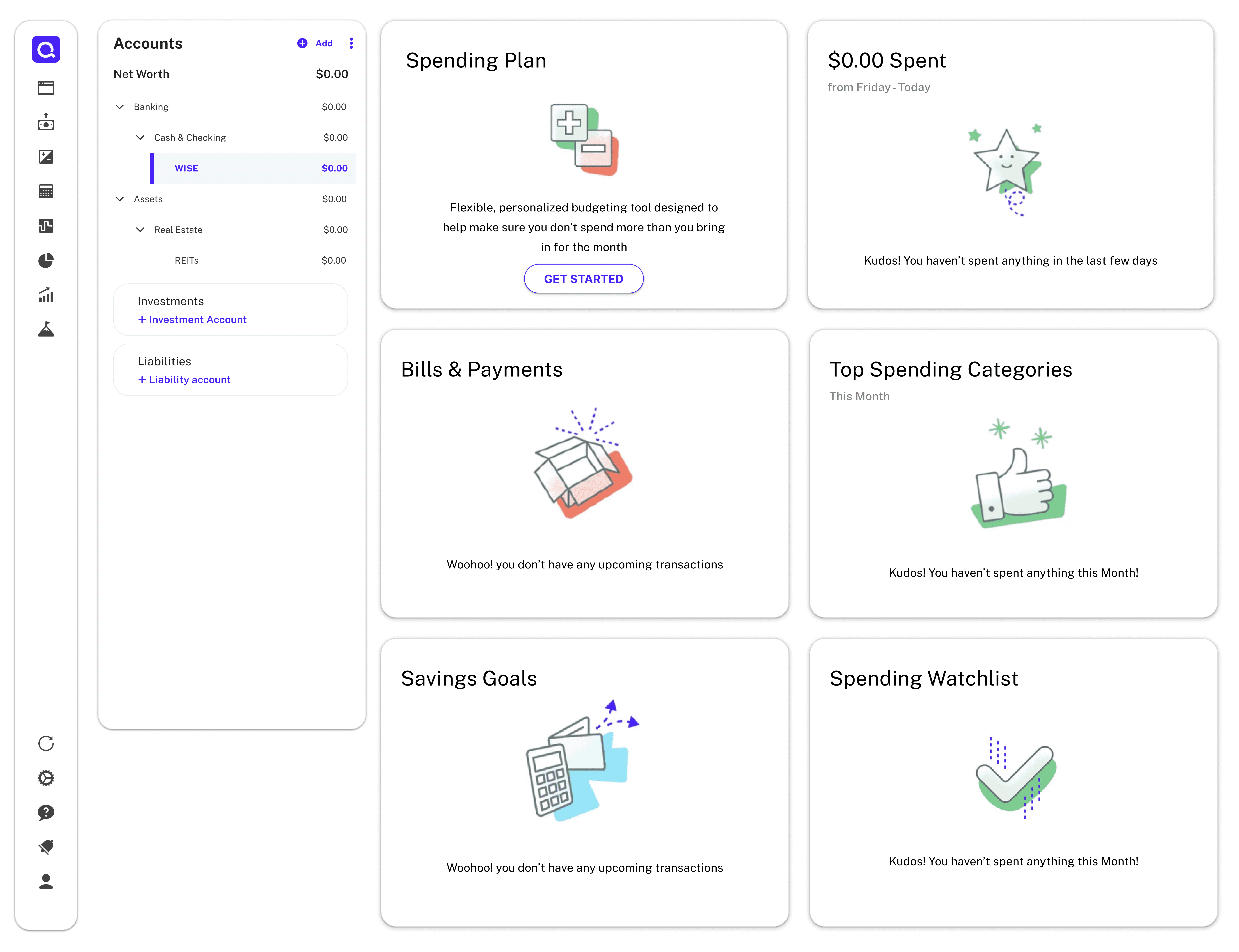
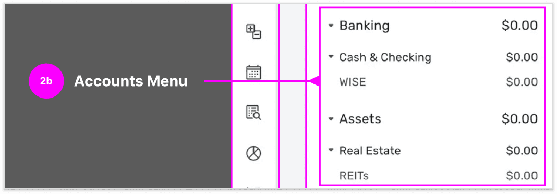
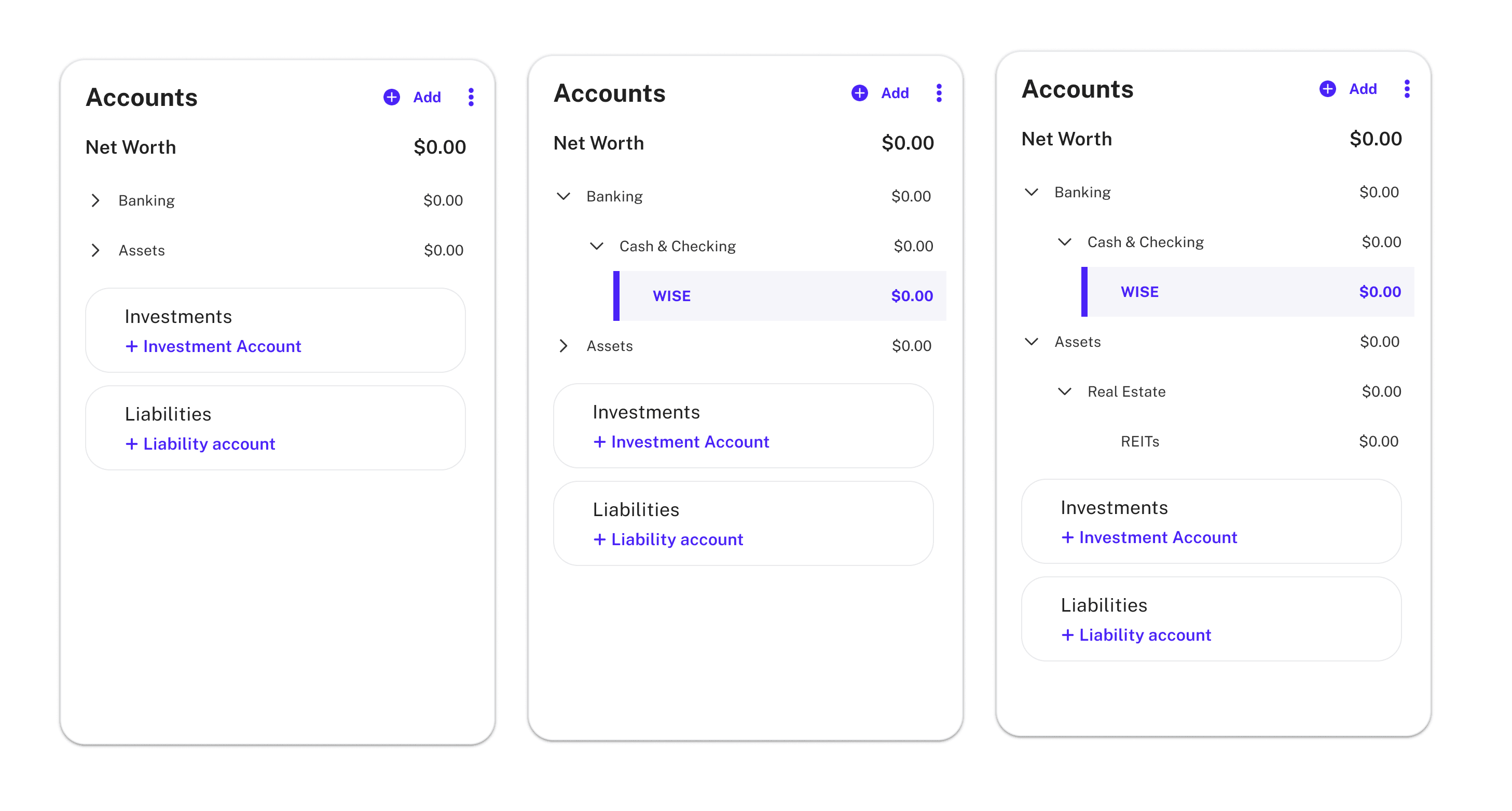
Identify the product section to be audited, which, in this case, is limited to the Quicken accounts page. Document and annotate the existing components.
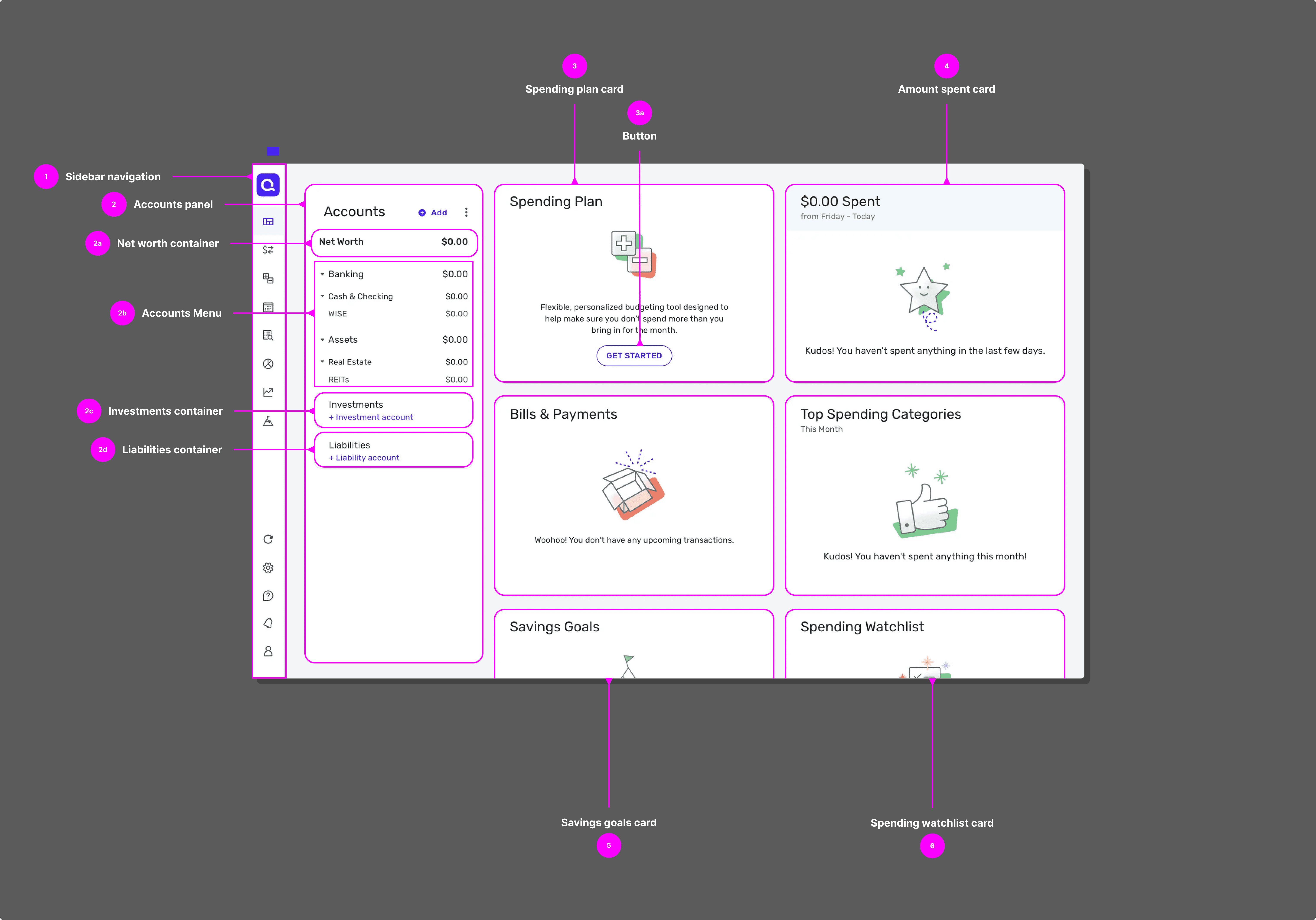
After conducting interviews with the product teams, I determined that a sortable spreadsheet highlighting the key characteristics to track for sprint planning would be beneficial. This tool will enable better organization and prioritization of tasks. Annotated screens provide visual context, identifying each component along with its current status. This approach helped both designers and developers have a solid understanding of the project, enhancing and alignment throughout the development process.

Problem
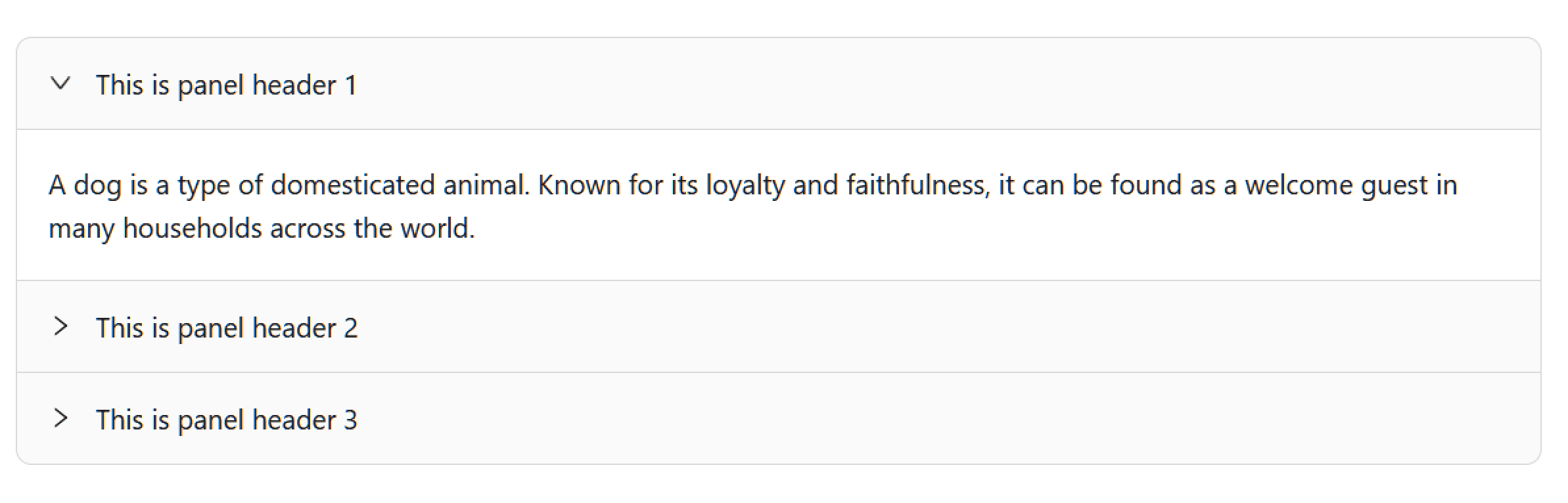
What happens if we find a component in the old design system with no match to the current one, or there is a possible match, but it doesn't fit our new needs?
Problem confirmation
The in-house design system lacks a collapsible component that can handle these nested categories effectively. Without a suitable component, users may struggle to navigate the interface efficiently, leading to potential usability issues. Let's go through the approved process for dealing with this issue.
Evaluate the need
Confirm there is no existing component or pattern that can be used. Look at common patterns that exist. Exhaust every other option before creating a new component.
Design
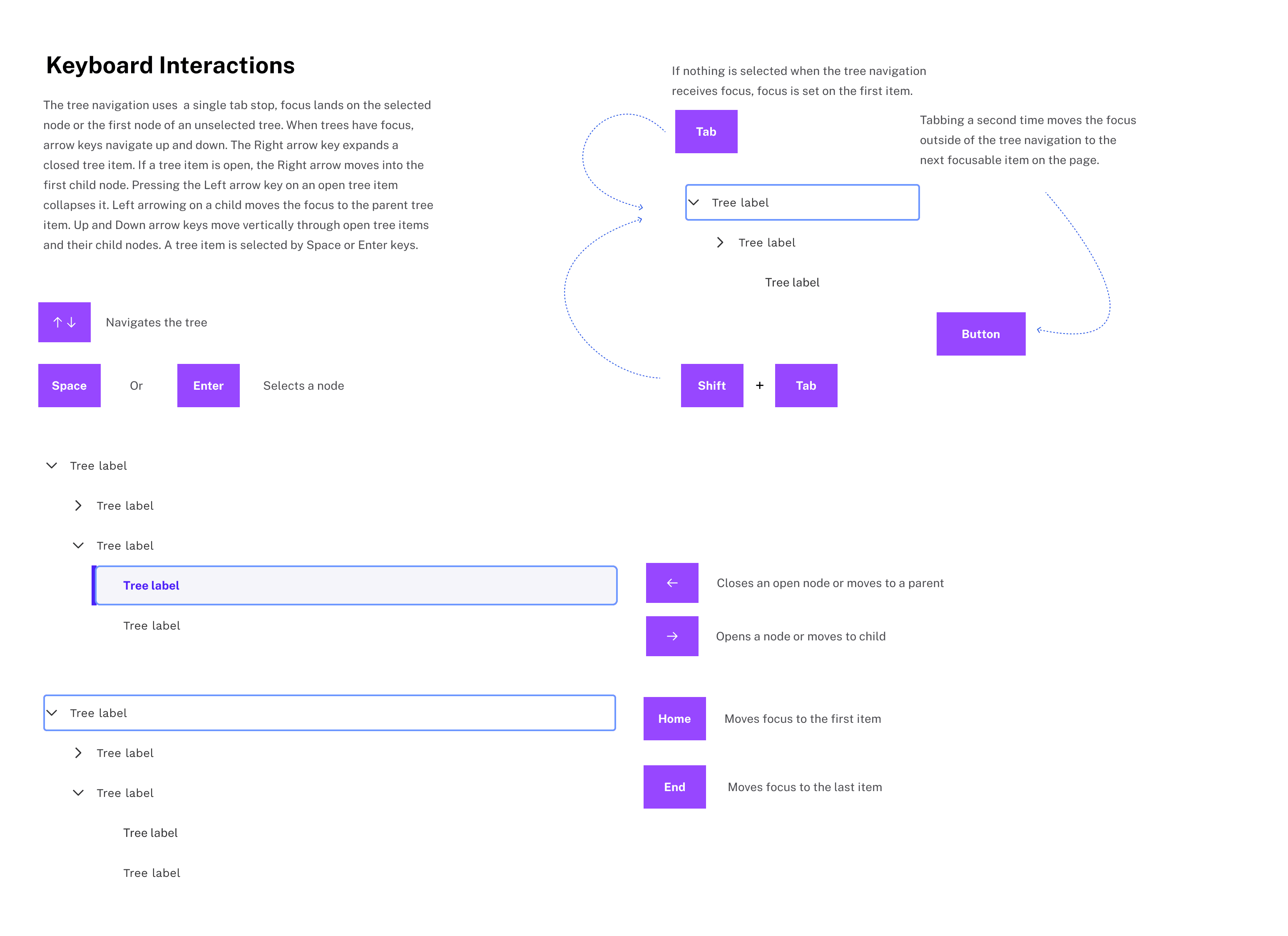
Define success criteria, design the new component. Design a storyboard and explain keyboard, mouse and screen reader interactions.
UX Reviews
Visit office hours for feedback.
Go over a11y requirements and talk to product partners and segment colleagues for validation.


Challenges
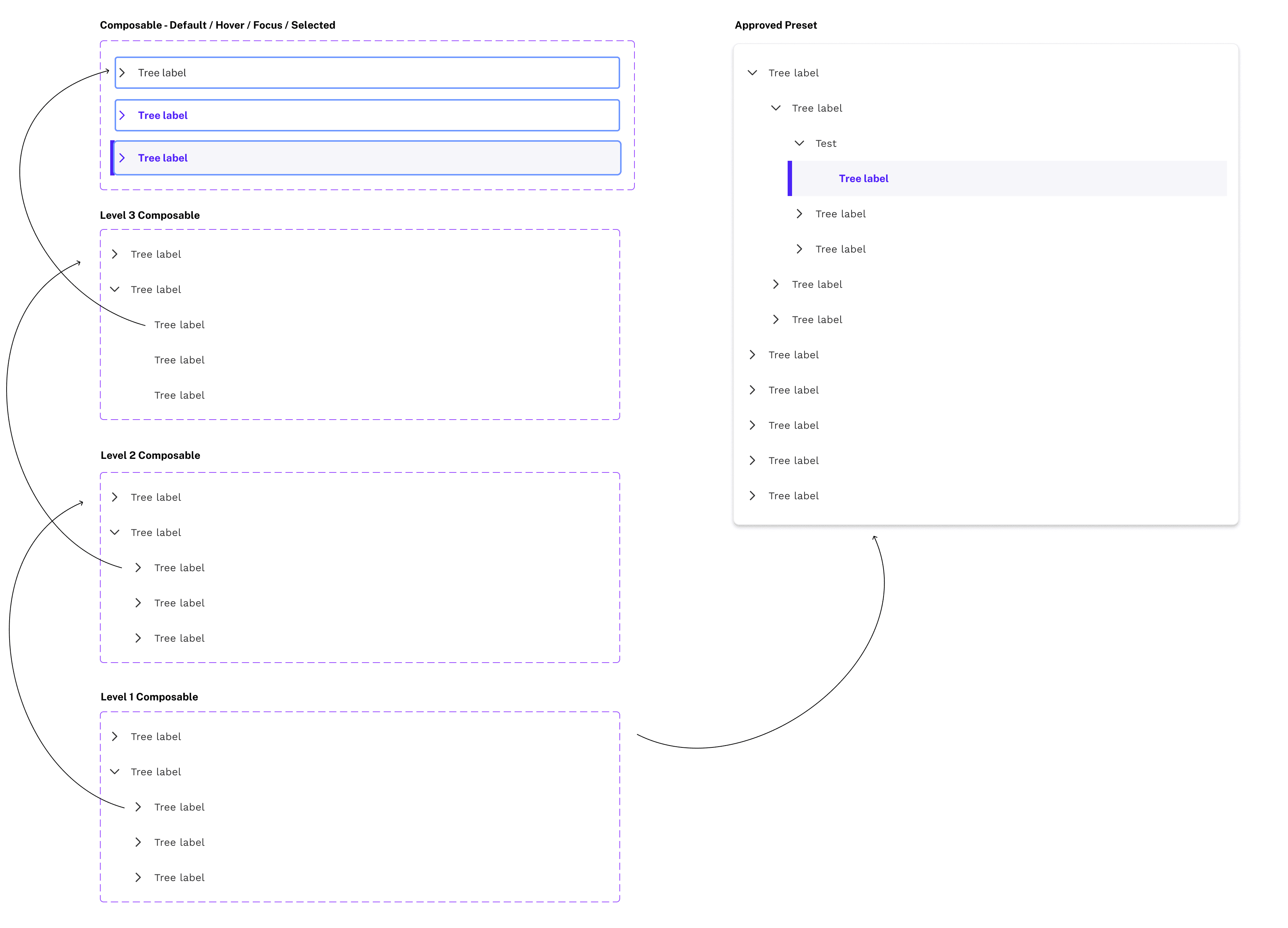
Based on requirements that were researched through the card sort, it was determined that 6 parent levels, and 3 expandable child levels were needed.
The major challenge was designing a flexible component that easily allows designers to create menu setups according to their project requirements. Two approaches were used, the first was a single component that had states for different levels that adjusted the left padding.
This proved to be a little difficult to work with after bringing it to design critiques and receiving feedback. There needed to be a way for the designer to click in and use boolean properties to expand / collapse every level.
I used a tiered approach where the level 1 composable is made from an expandable level 2 and so on. This allowed every inner level to be expandable / collapsible as well as inheriting all the required based states from the "kitchen sink" composable which has default, hover, focus border and selected states.
Final screens & sticker sheet
I met with a11y partners to vet the component for accessibility and included a sticker sheet for developers to be able to understand how to program keyboard interactions.
I learned a ton about creating components in Figma, and in general. I learned how to keep accessibility in mind, and visually represent keyboard interactions. I learned how to design for designers, and create components that are easy to use. This really jump started my passion for systems thinking.

Work impact
While I was just an intern, the work I did had an impact on the team. The audit process I worked on is going to be rolled out in Q4 and expanded upon with user metrics.
The component is designed in an intuitive and reusable way making the process of moving it into the development phase much easier. Having the a11y requirements documented and visualized will also allow teams to get the component published much faster.